UX Design · Fintech · Morgan Stanley · 2024
Morgan Stanley at Work
Redesigning the tax payment elections workflow to help private company employees feel financially confident when paying for their stock grant taxes — while meaningfully reducing the time it takes to complete the process.

How might we enable private company employees to feel financially confident when paying for their stock grant taxes — and reduce the time it takes to complete that process?
Private companies offer restricted stock units (RSUs) as workplace benefits. When RSU conditions are met, employees must pay taxes before shares are issued. Each employee chooses one of three payment methods: withholding restricted stock units to cover taxes (which reduces the number of shares they receive), paying out of pocket with personal cash (which keeps all shares intact), or a hybrid partial approach (which splits the difference — contributing some cash while withholding fewer shares). The method they choose directly affects how many shares end up in their account.
The legacy experience required users to complete a separate workflow for every single stock grant. For employees managing multiple grants, this meant repeating the same tedious steps over and over — a fragmentation issue that generated complaints representing 90% of customer support tickets.
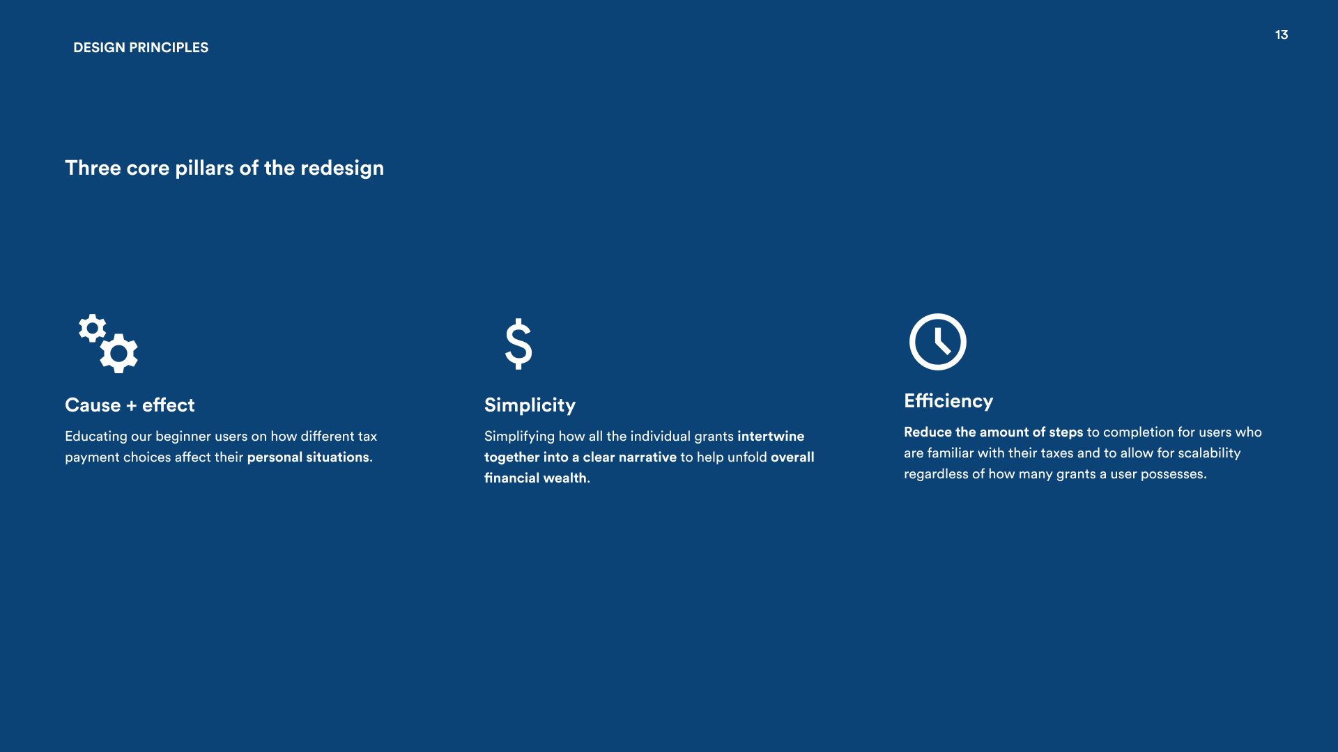
Three core pillars
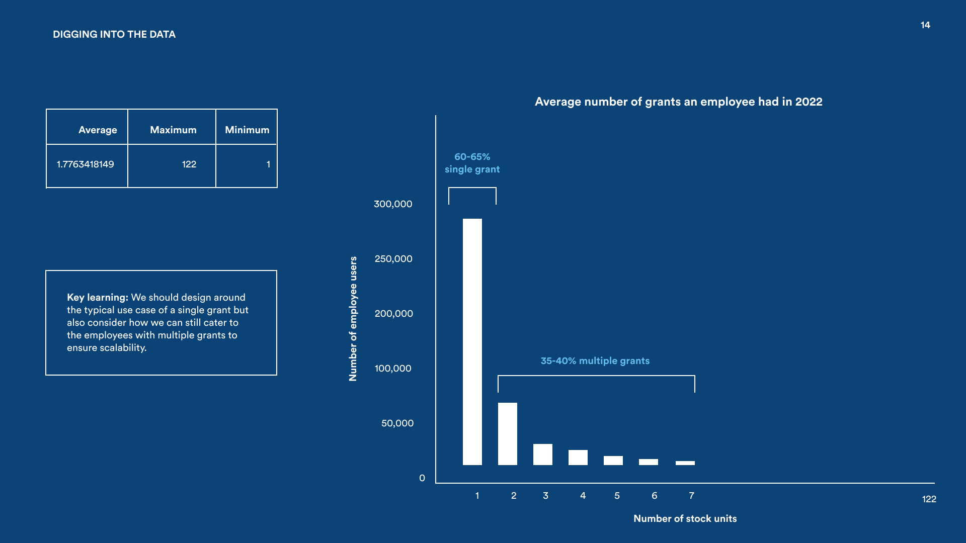
To get alignment on these pillars early, I dug deeper into the usage data before any design work started. The bar chart below shows the distribution of stock unit counts across the user base — the vast majority of employees hold just one grant, but the long tail extends all the way to 122. That spread meant the solution had to work elegantly at both extremes.
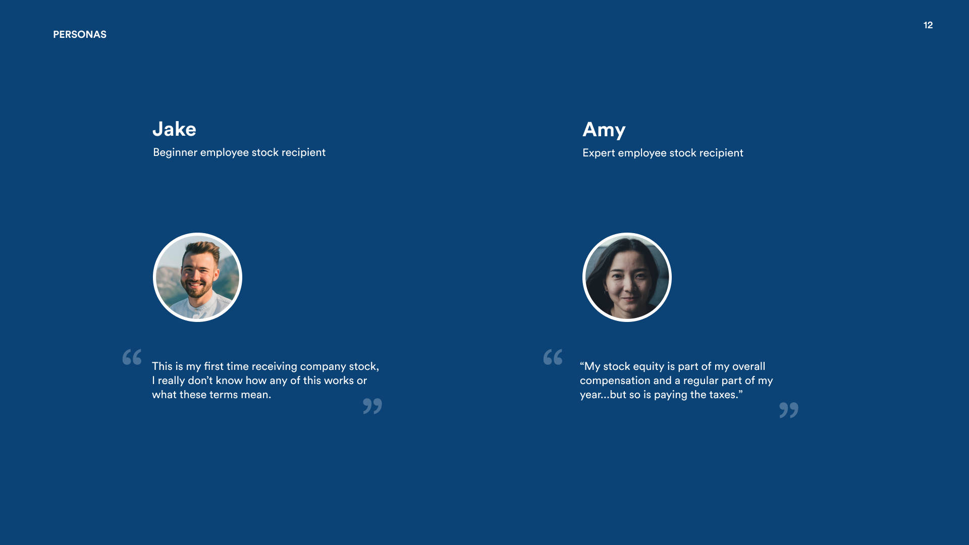
Two distinct users: Jake and Amy
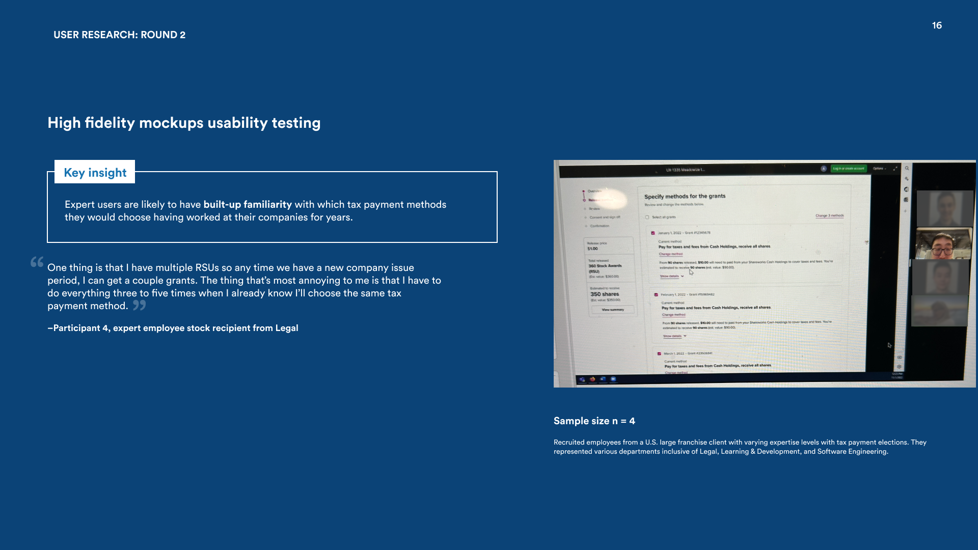
Research surfaced two very different people using the same product. Jake is a first-timer — he's never been through this before and needs guidance on what each payment method actually means. Amy is a seasoned employee with a strong preference and zero interest in being walked through something she's done many times. The data showed that most employees hold a single stock unit, but the range goes all the way to 122, so whatever we built had to work cleanly at both extremes — for Jake seeing one grant for the first time, and for Amy blowing through dozens.
Establishing design principles with the PM
Before a single wireframe was drawn, I sat down with the Product Manager to make sure this project wasn't just a visual refresh. We ran a structured brainstorming session where I walked through the two personas — Jake and Amy — and asked the PM to describe what "success" looked like for each. That conversation surfaced some real tension: the PM's instinct was to optimize for Amy's speed, but the research showed Jake was far more likely to call support and generate cost.
From that conversation, we landed on three principles that would guide every design decision: meet users at their level of financial literacy (not assume everyone is an expert), make choices feel consequential but not scary (show the outcome of each method clearly), and respect the expert's time (let Amy power through without being slowed down by education she doesn't need). Having these written down meant every subsequent design review had a shared vocabulary to evaluate against — not just personal taste.
Diverge, then converge
During the divergence phase, I ran a cognitive walkthrough with 10 UserTesting participants. The clearest finding: beginner users like Jake were paralyzed by the payment choice step. They weren't sure what each method actually meant for their wallet, so they couldn't commit to a decision.
For convergence, I recruited 4 employees from a major franchise client and ran hypothetical task testing with them. Afterward, the PM, the development team, and I did an affinity mapping session to make sense of everything we'd heard and turn it into a concrete direction.
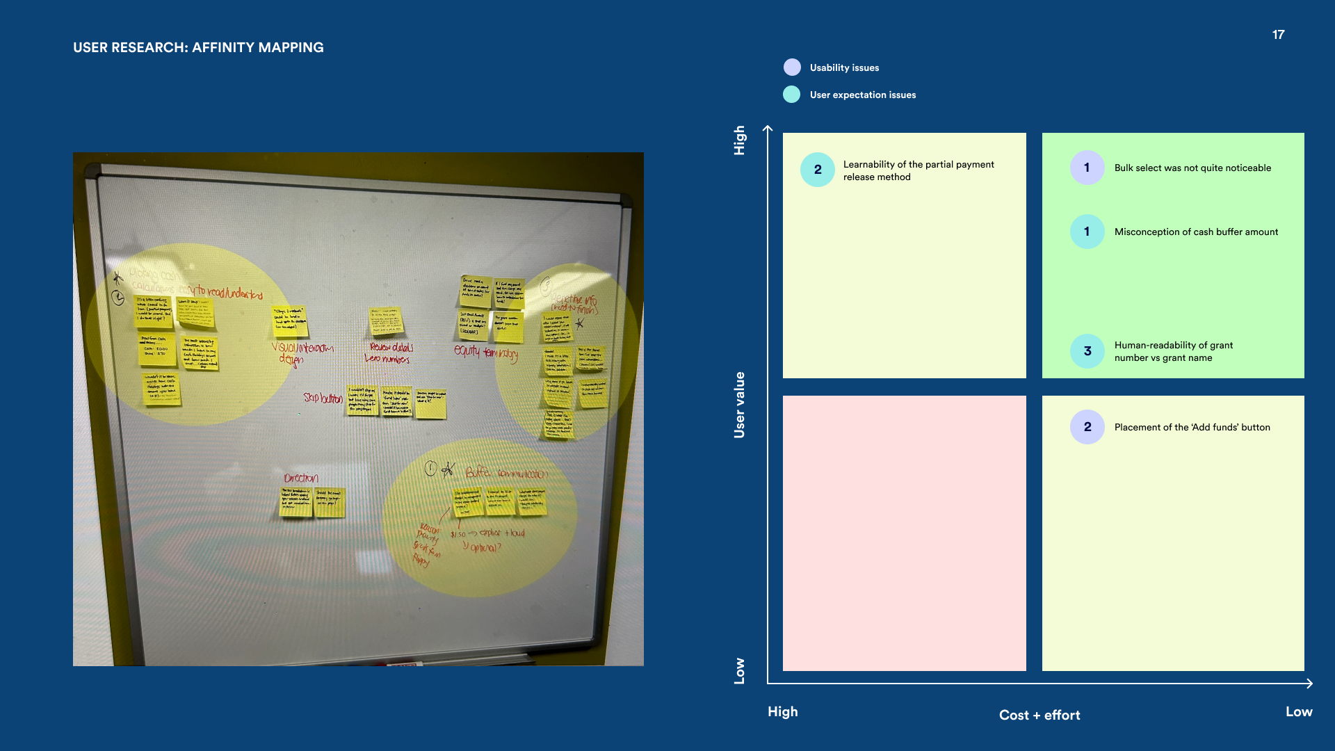
Five insights that shaped the solution
5 steps, one cohesive experience
Welcome — Set the stage
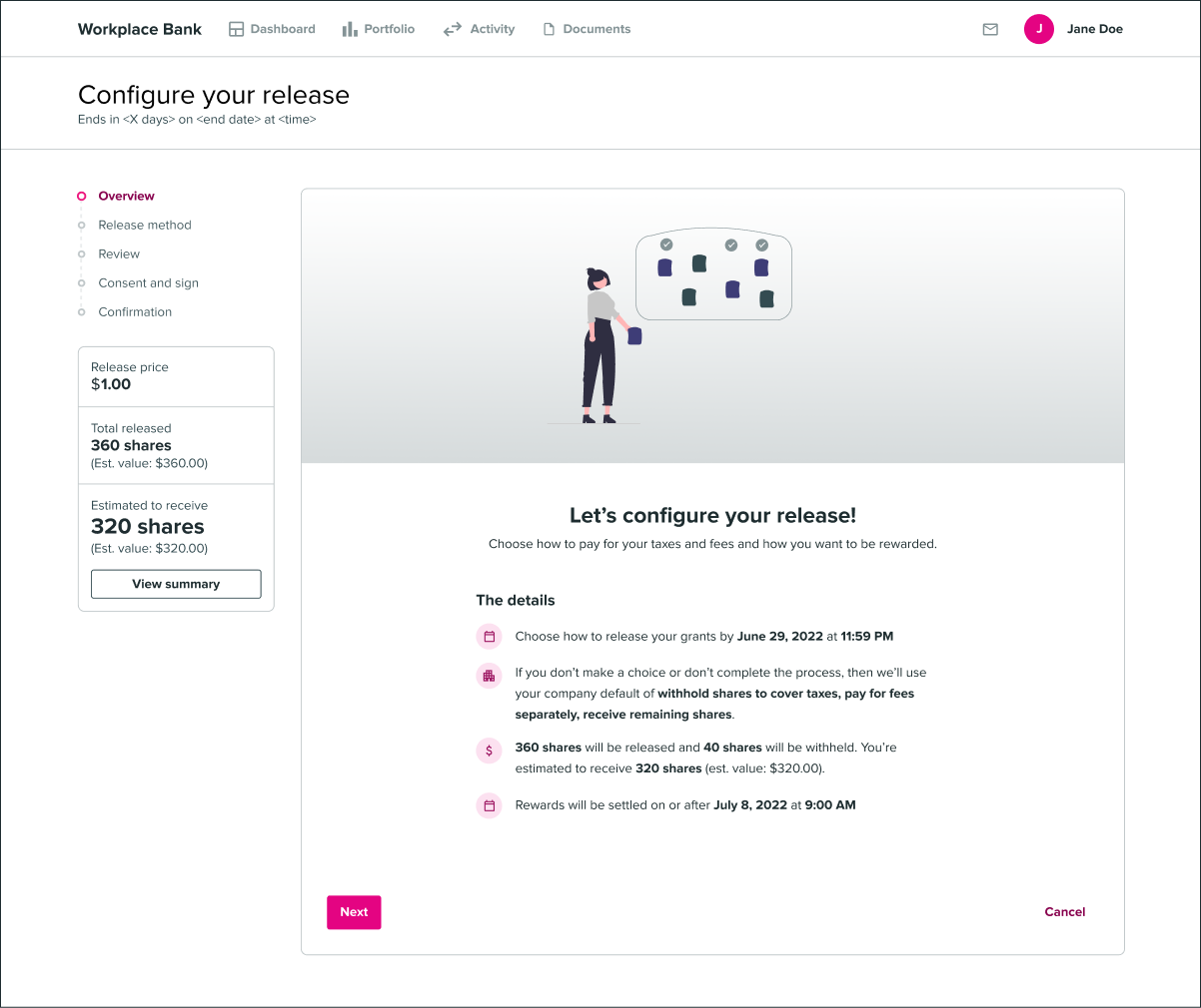
Users who are happy with the company default can exit immediately — no friction for the people who don't need help. For everyone else, a sticky financial summary bar keeps total wealth visible throughout the whole flow, so employees never lose sight of what's at stake.
Education — Meet users where they are
For users like Jake who've never done this before, a dedicated education step explains what each payment method actually means for their share count. The goal isn't to overwhelm — it's to give just enough context so that the next step, choosing a method, feels like an informed decision rather than a guess.
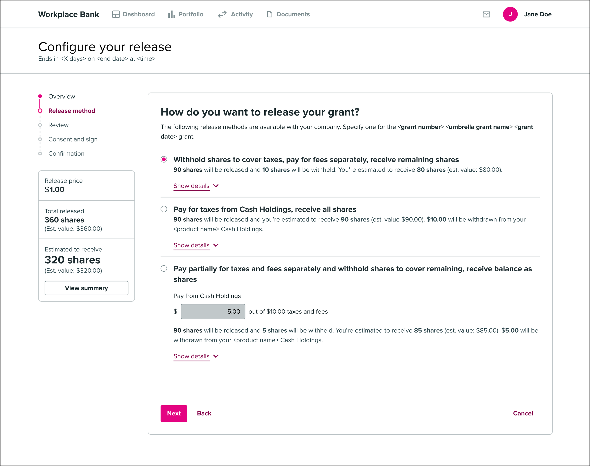
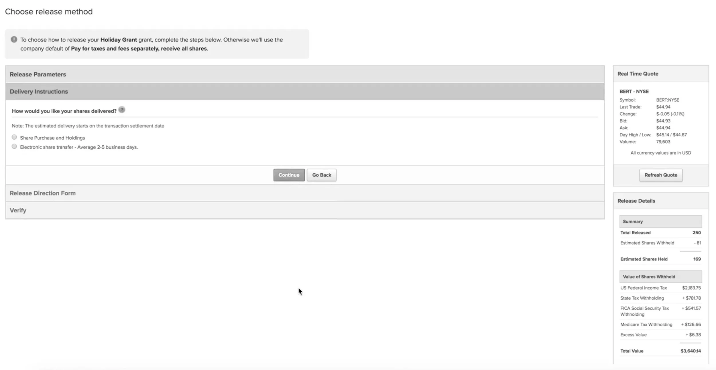
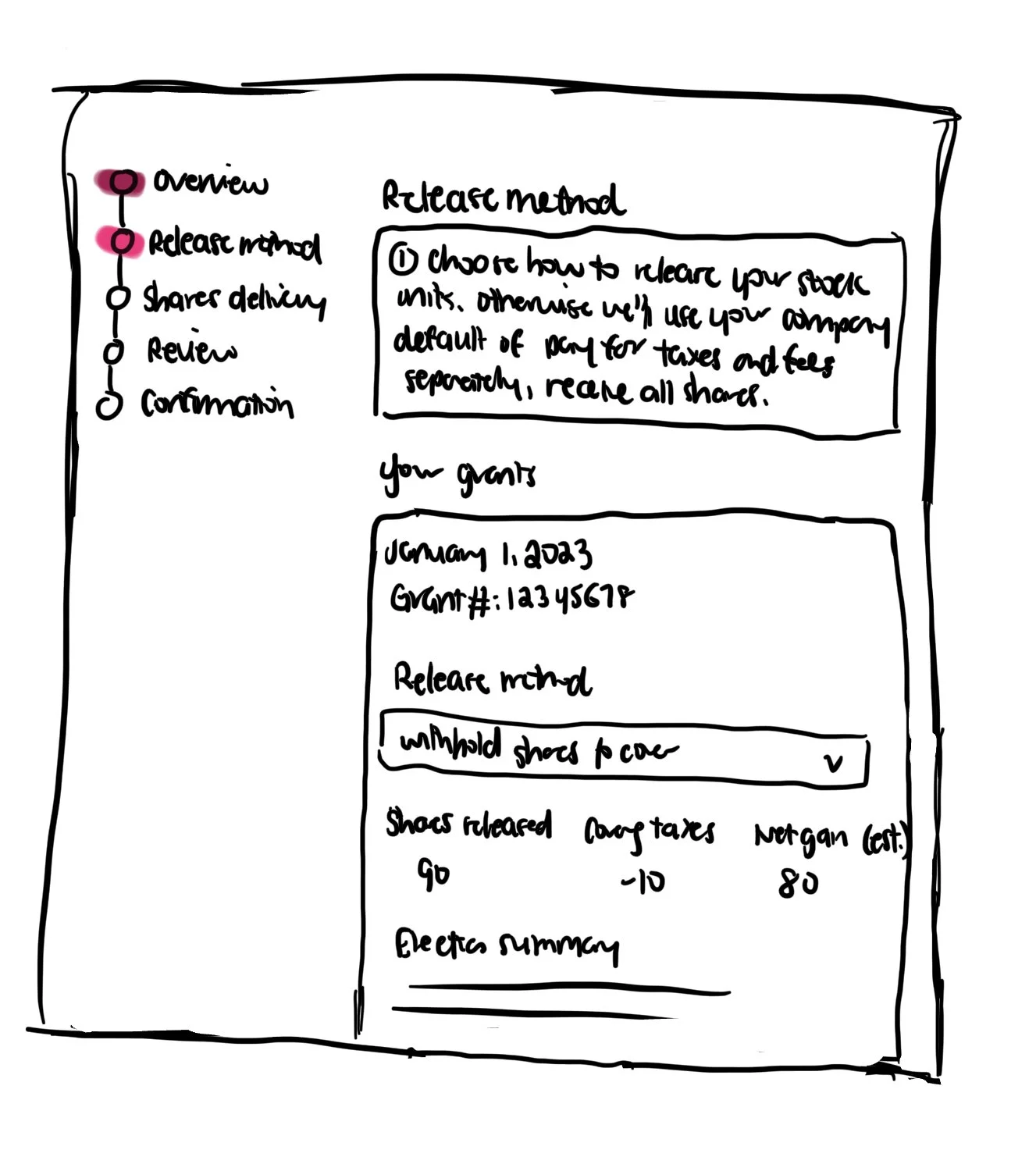
Release Method — Show the outcome, not just the option
Each tax payment method is presented with its downstream effect made explicit — how many shares you'll walk away with, and what you'll owe in cash. Users can compare all three choices side by side, and the copy is written to encourage genuine financial reflection rather than a reflexive default pick.
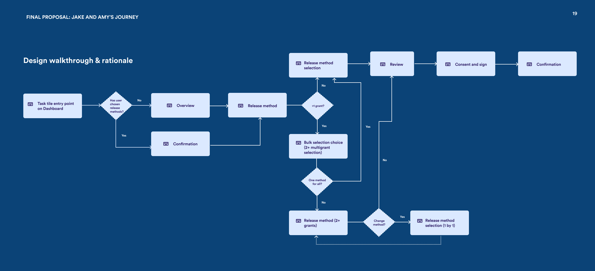
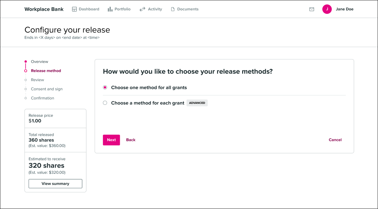
Grant Selection — One decision for all your grants
This is where the legacy experience broke down the most. The new design uses progressive disclosure to handle both single and multiple grant scenarios cleanly. Expert users like Amy can bulk-apply a single election across all their grants at once — what used to take a dozen repetitive flows now takes one.
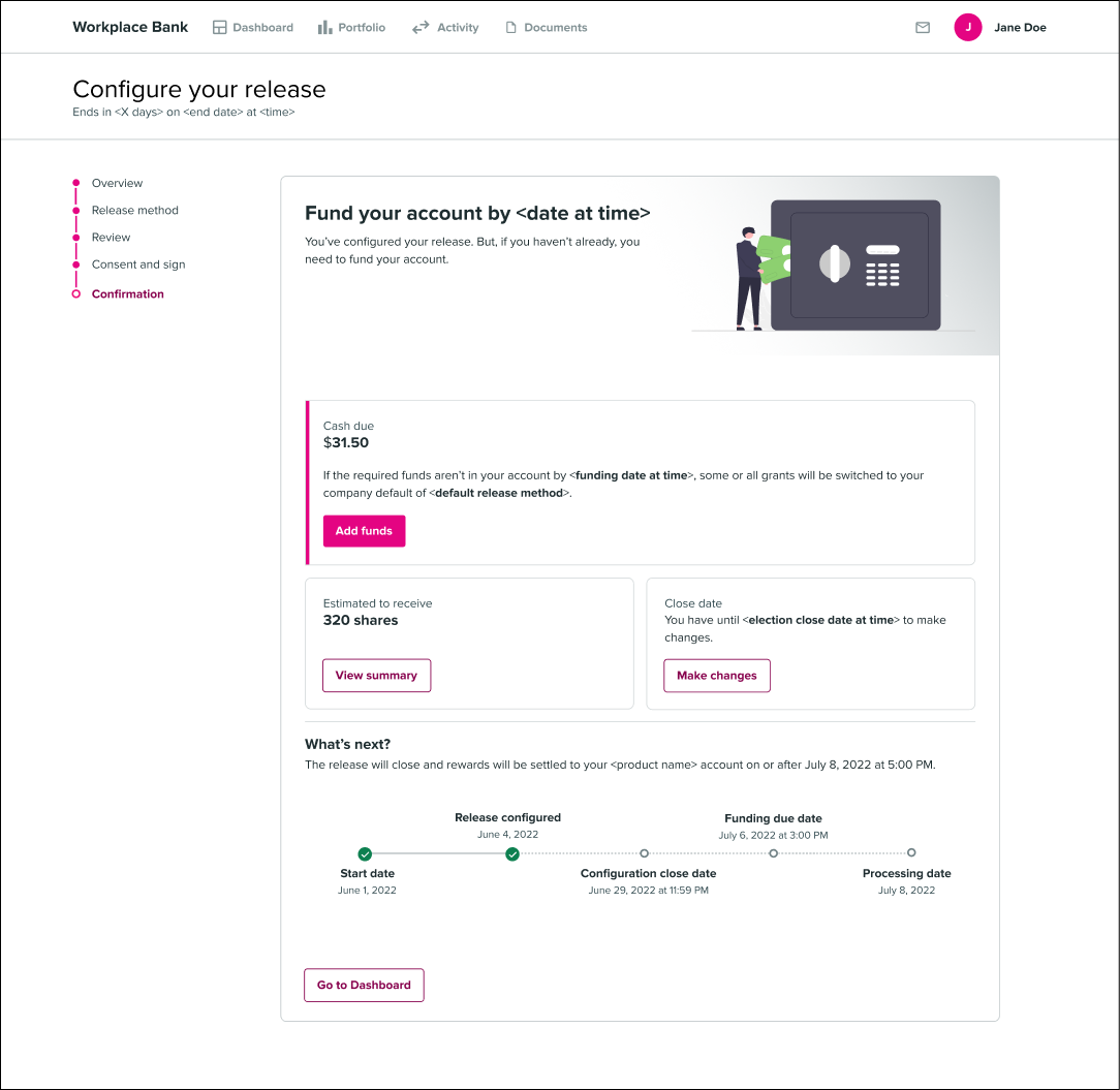
Confirmation — Close with clarity
The confirmation step makes the funding action visually prominent so nothing gets missed at the finish line. Users see a clear timeline for when shares will land in their account — which we expected to head off a meaningful chunk of the "where are my shares?" support calls.
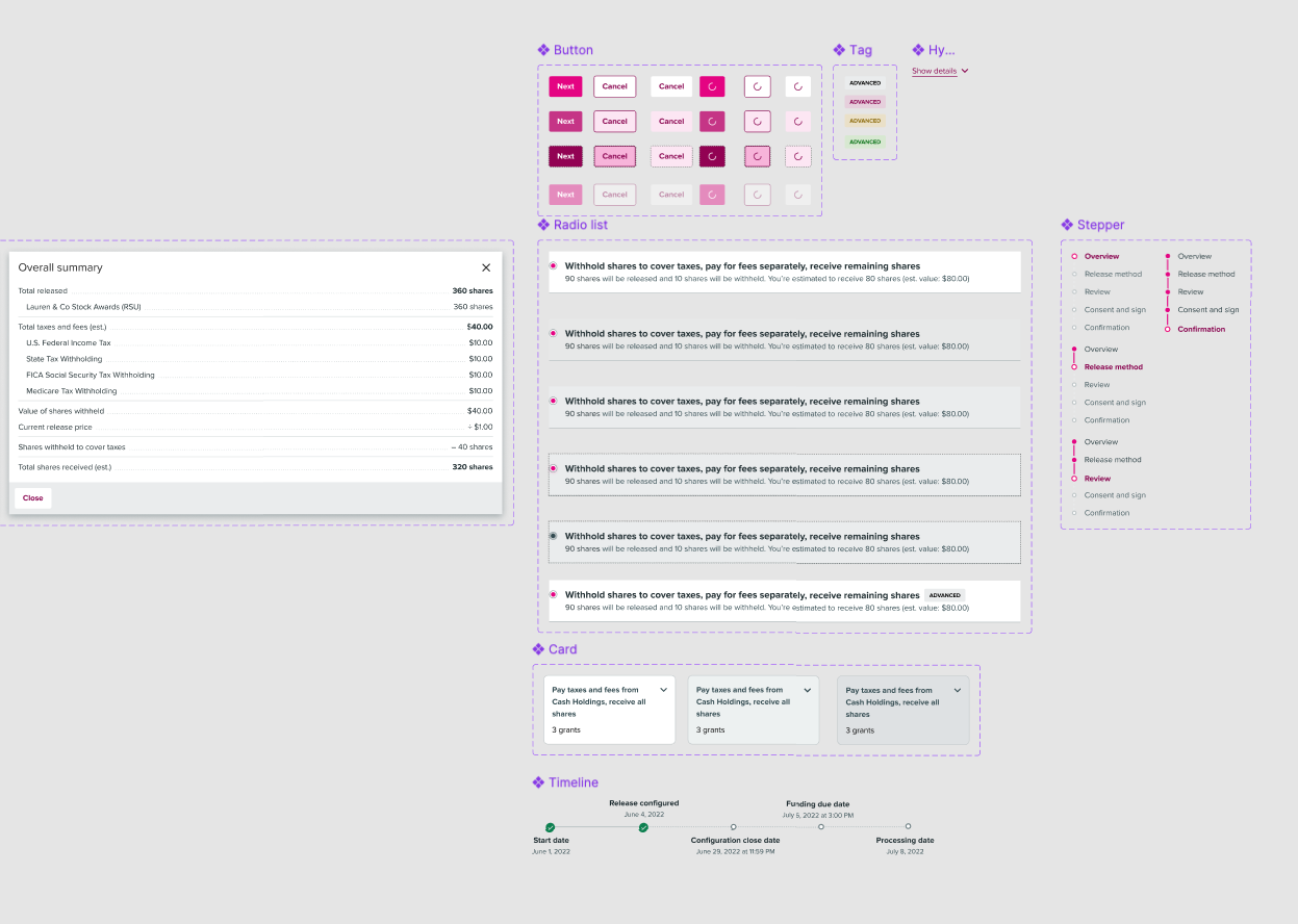
Scalable, accessible components
Throughout the project I built out a set of scalable, accessible components for the Morgan Stanley design system. The aim was threefold: speed up the design process for this project, keep the visual language consistent with adjacent workflows, and make it easy for other designers to pick up and extend the patterns without starting from scratch each time.
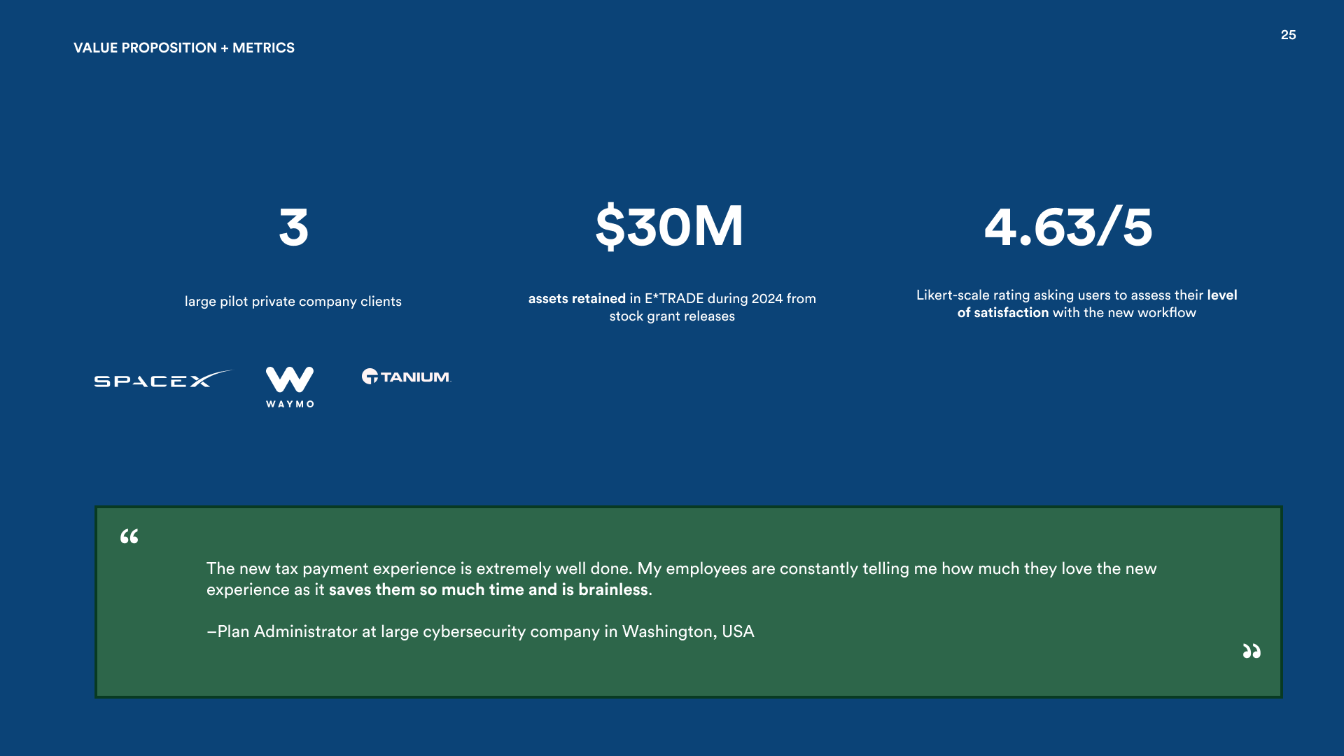
Pilot rollout, overwhelmingly positive sentiment
The redesign is currently in a pilot program with the 3 largest private company clients, and the early signal is strong — overwhelmingly positive sentiment from both employees and the administrators who support them. Full rollout to remaining private company clients is planned for the coming quarters.
Proposed success metrics include: the average time employees spend completing the tax election workflow (compared against the legacy baseline), inbound communications from Stock Plan Administrators about user confusion, and total support ticket volume before and after the new experience ships. The time comparison is particularly telling — if the new flow genuinely consolidates what used to be grant-by-grant repetition, we'd expect to see a meaningful drop in completion time for users with multiple grants. Ongoing monitoring will help catch friction points as the rollout reaches the broader client base.